In early 2016, I started my transition from graphic designer to user experience designer at Thinking Capital. My project specifically was to improve the Online Financing Application. I designed an end-to-end experience, which shipped in September 2016. This case study will focus on the initial deliverable's of the project.
Building the first online application gave us great insights on how to improve OUR subsequent experiences. We had an understanding of some of the shortcomings:
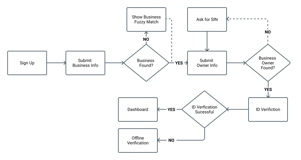
Before we started to layout any of the processes, wireframes and mockups, I conducted a workshop to review the existing application. The objective was to narrow down our required fields to only the minimum needed to provide a customer with financing.
Early on, we used brainstorming sessions to explore different versions of the overall end to end flow and discussing possible drop-offs and kick-outs.

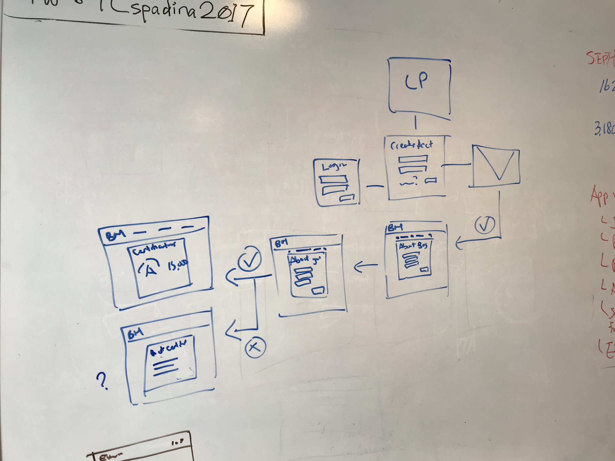
Once we had a high-level look at the direction we wanted to take, I started creating user flows to illustrate the various journeys for the new process.
User On-boarding Flow
After defining all the user flow variations, I started sketching out the first version of the experience. These rough wireframes gave us an idea of how much shorter the new application would be and gave us the foundation for future iterations.
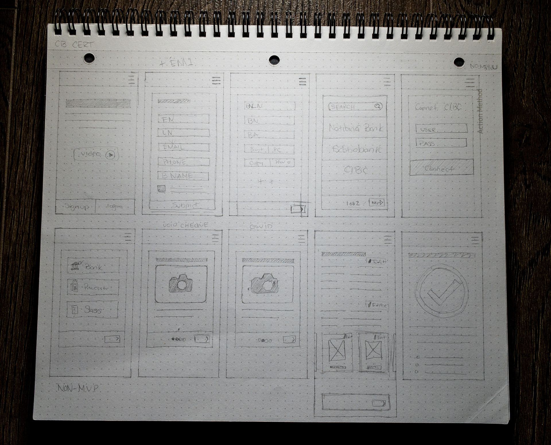
Wireframe Sketches
The next step was creating low fidelity desktop and mobile mock-ups to add some much-needed detail to every screen designed in the wireframe phase. We then took created simple prototypes for various parts of the experiences to be able to gather customer feedback.
With the low fidelity prototypes created, we used usertesting.com to gather feedback from a lookalike audience of users. We were able to derive a lot of useful information from these sessions and implement them into our first testable product.
After the testable version was live, we used it to continue to gather feedback and understand product usage. During this time, Thinking Capital got purchased, and we started to port the new application to our sister companies' banking platform. My job was to adapt my existing designs to fit within the structure of the platform. Once the app was live on the platform, I continued to help refine the experience through 2018 into 2019.
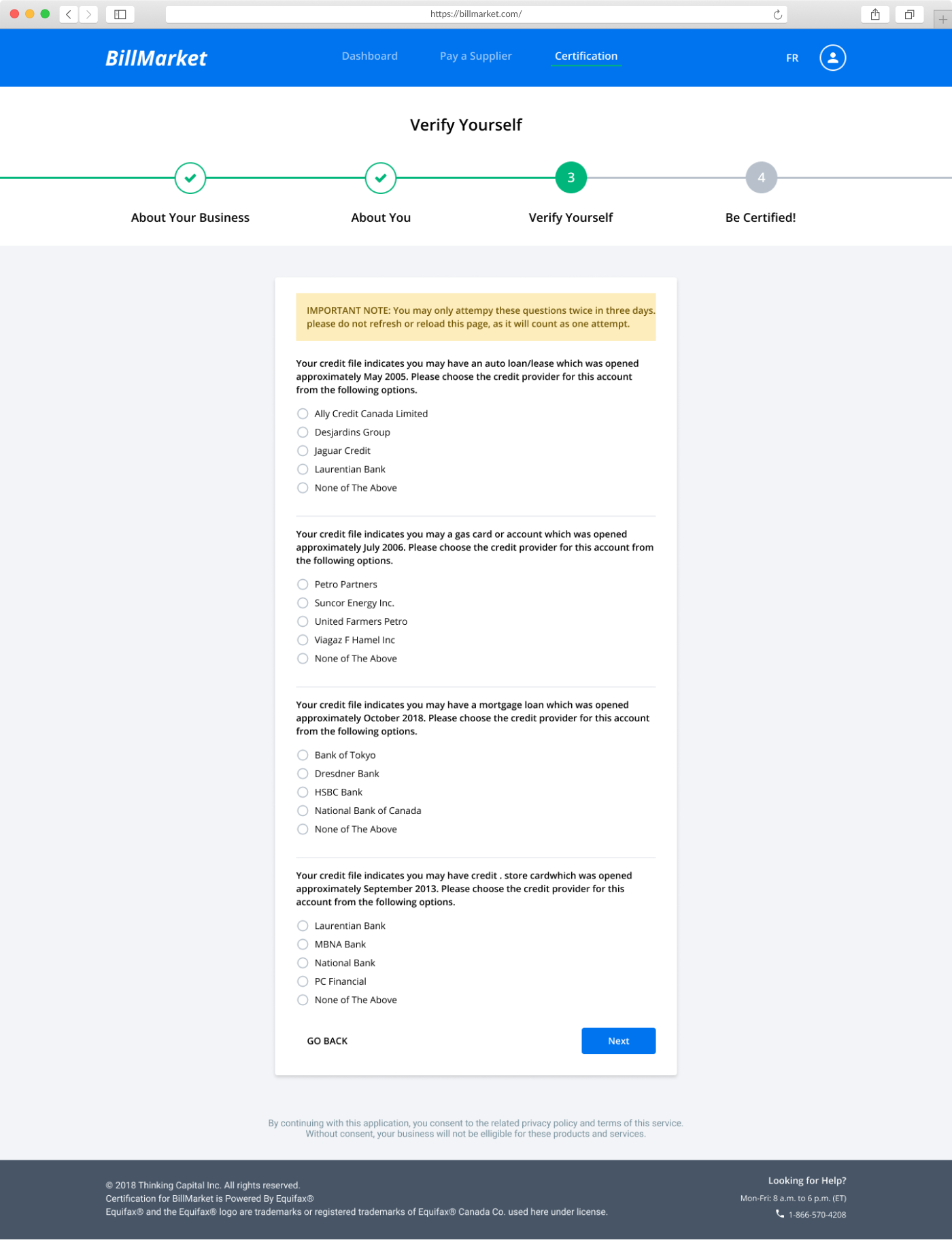
We solved for the extensive verification by leveraging services. In place of our previous government ID and void cheque we leveraged an Equifax service called E-ID.
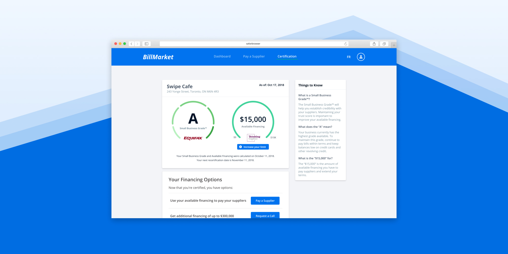
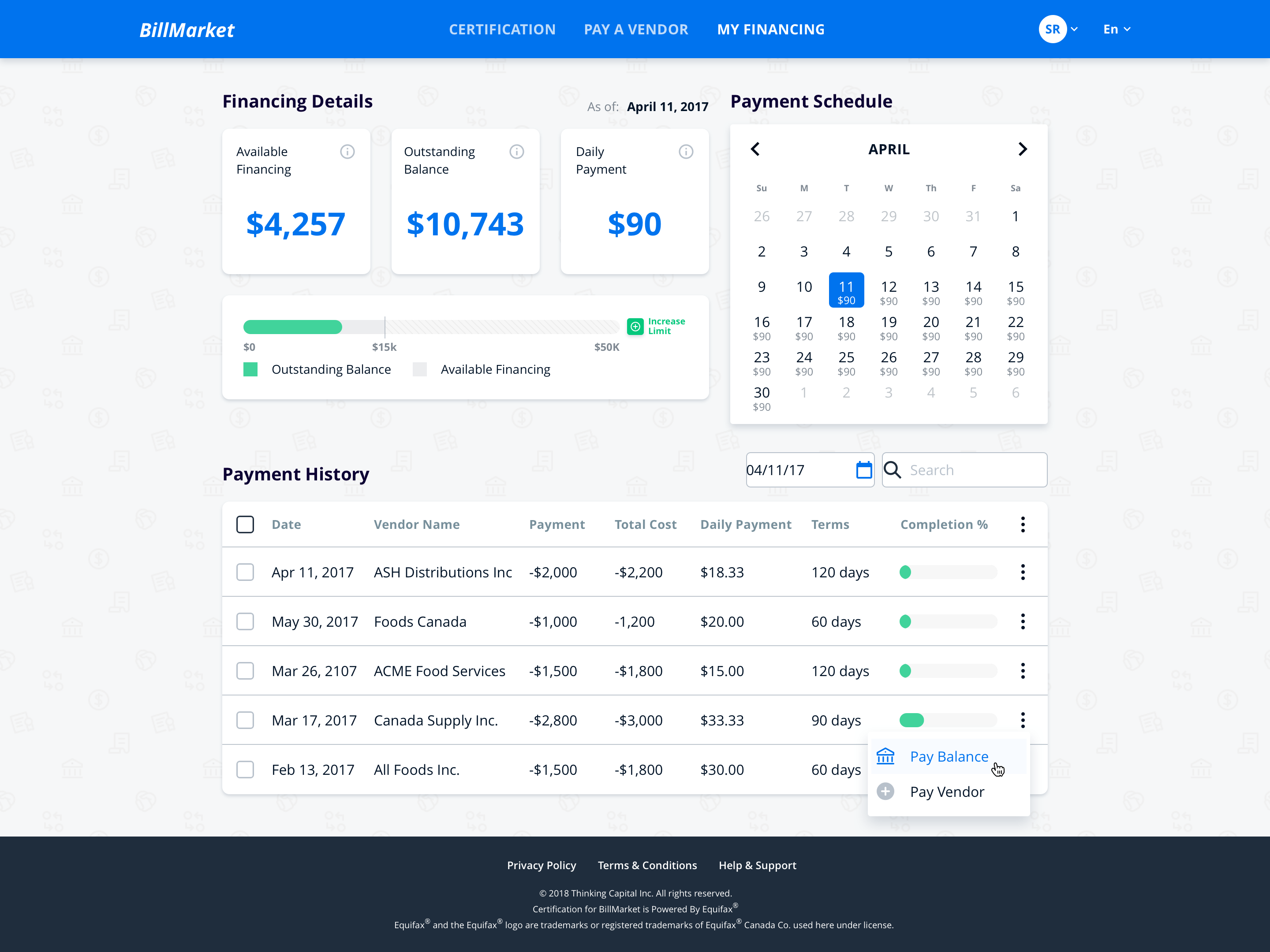
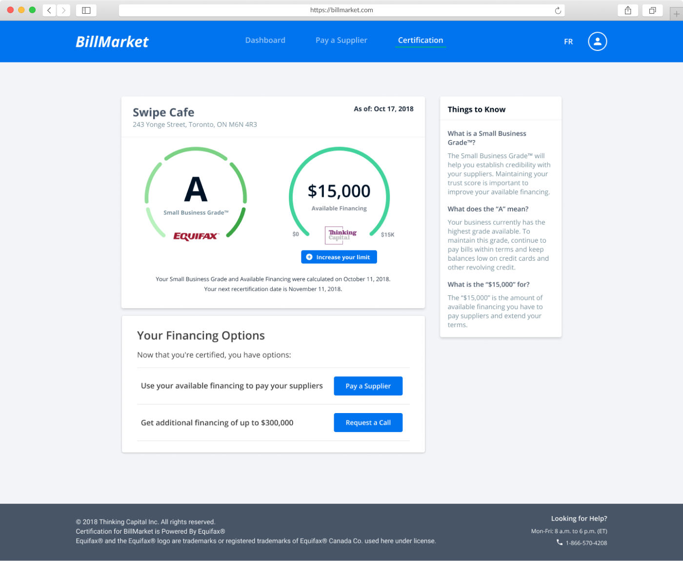
The dashboard is where the customer would be able to see their small business grade and associated available financing. We also added quick links to financing related tasks here as well.
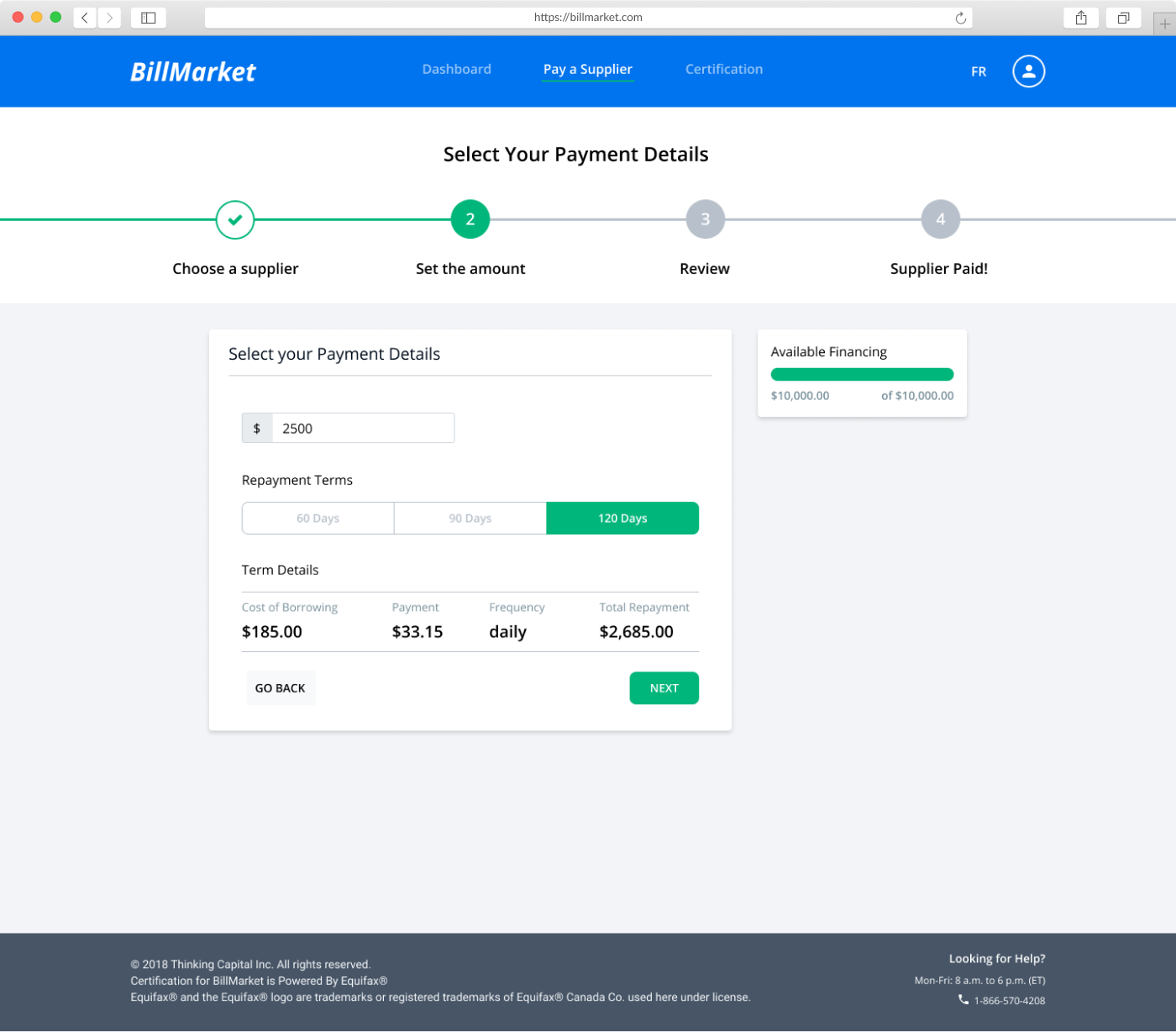
We used a wizard to guide the customer through making payments. I wanted to keep it close to existing paradigms for making payments like those found in online banking.