In early 2016, I started my transition from graphic designer to user experience designer at Thinking Capital. My project specifically was to improve the Online Financing Application. I designed an end-to-end experience, which shipped in September 2016. This case study will focus on the initial deliverables of the project.
To uncover the pain points with the existing experience, I conducted research interviews with various teams across the business. It revealed that:
Designing the user experience began with defining a user journey for the end to end experience. Once we established the initial journey, we started to develop flows for specific use cases.
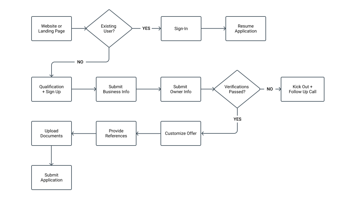
The end to end experience
After defining all the user flow variations, I started to visualize the vision through wireframe sketches. This process allowed us to visualize the stages of the application and explore new interaction types.
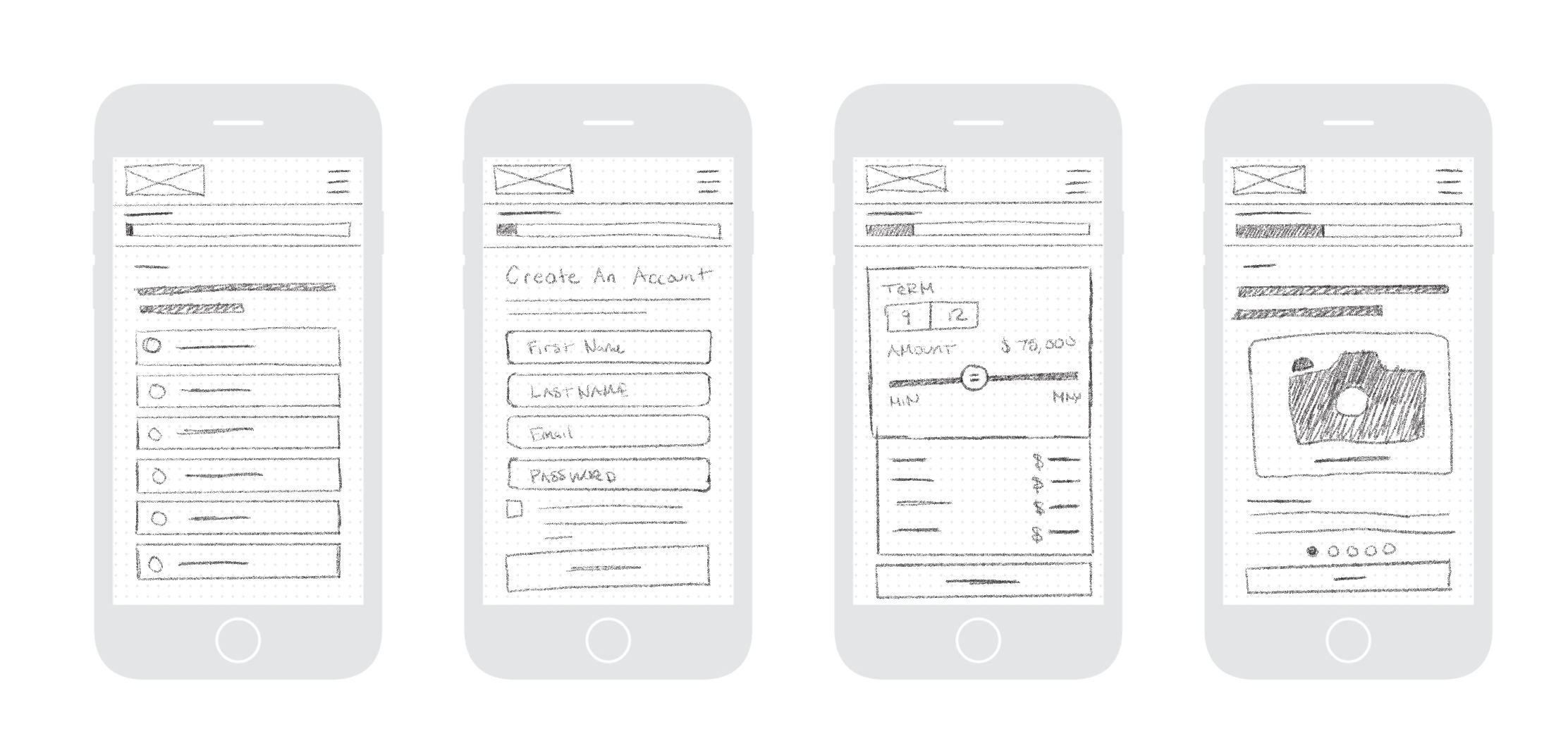
Samples of Early Wireframes
The low fidelity mock-ups helped us take the sketches to the next level. We created simple prototypes to illustrate the new flow and gather further feedback from internal stakeholders before moving on to the final high fidelity deliverables.
The prototype allowed us to gather immense amounts of feedback that allowed us to iterate and define a better MVP. The product continued to evolve visually based on input and technical limitations.
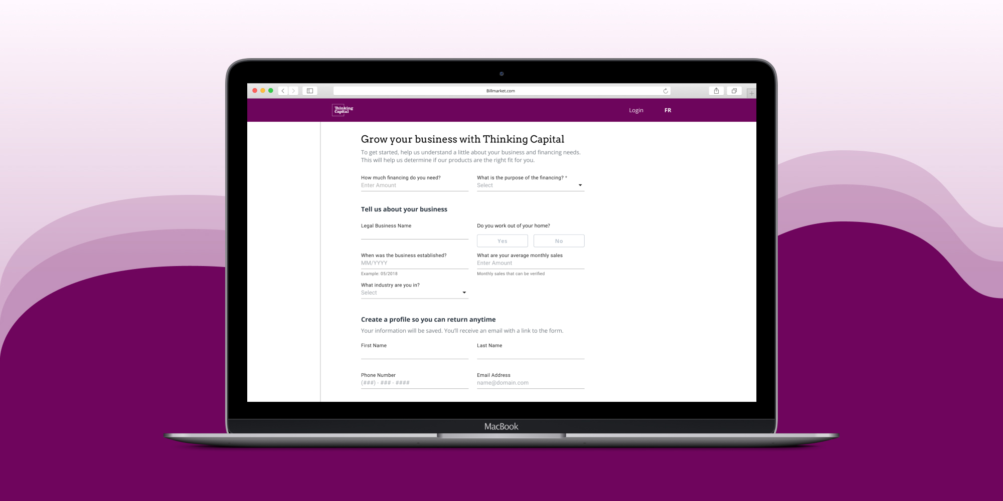
The first step of the new application was dedicated to qualifying the customer and establishing an account. The qualification questions help us prioritized servicing eligible customers even if they may have dropped off. Establishing an account allowed customers to leave knowing they could resume the application at anytime.
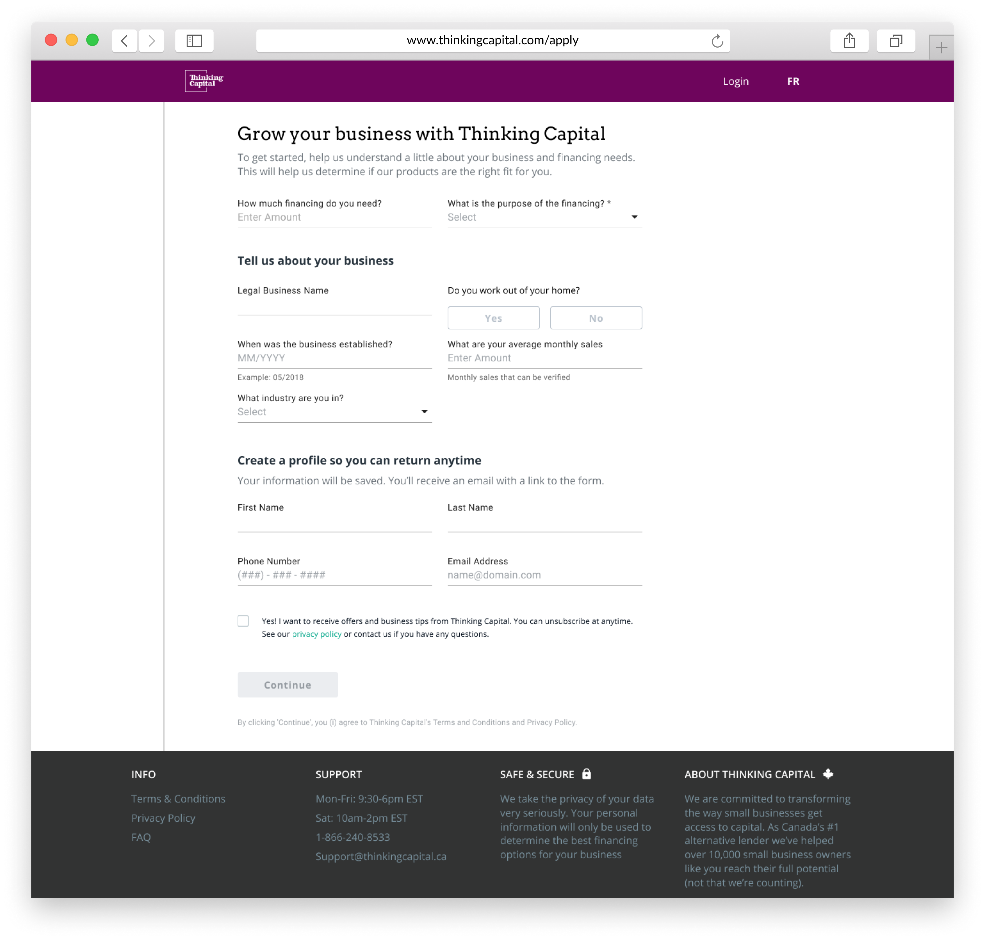
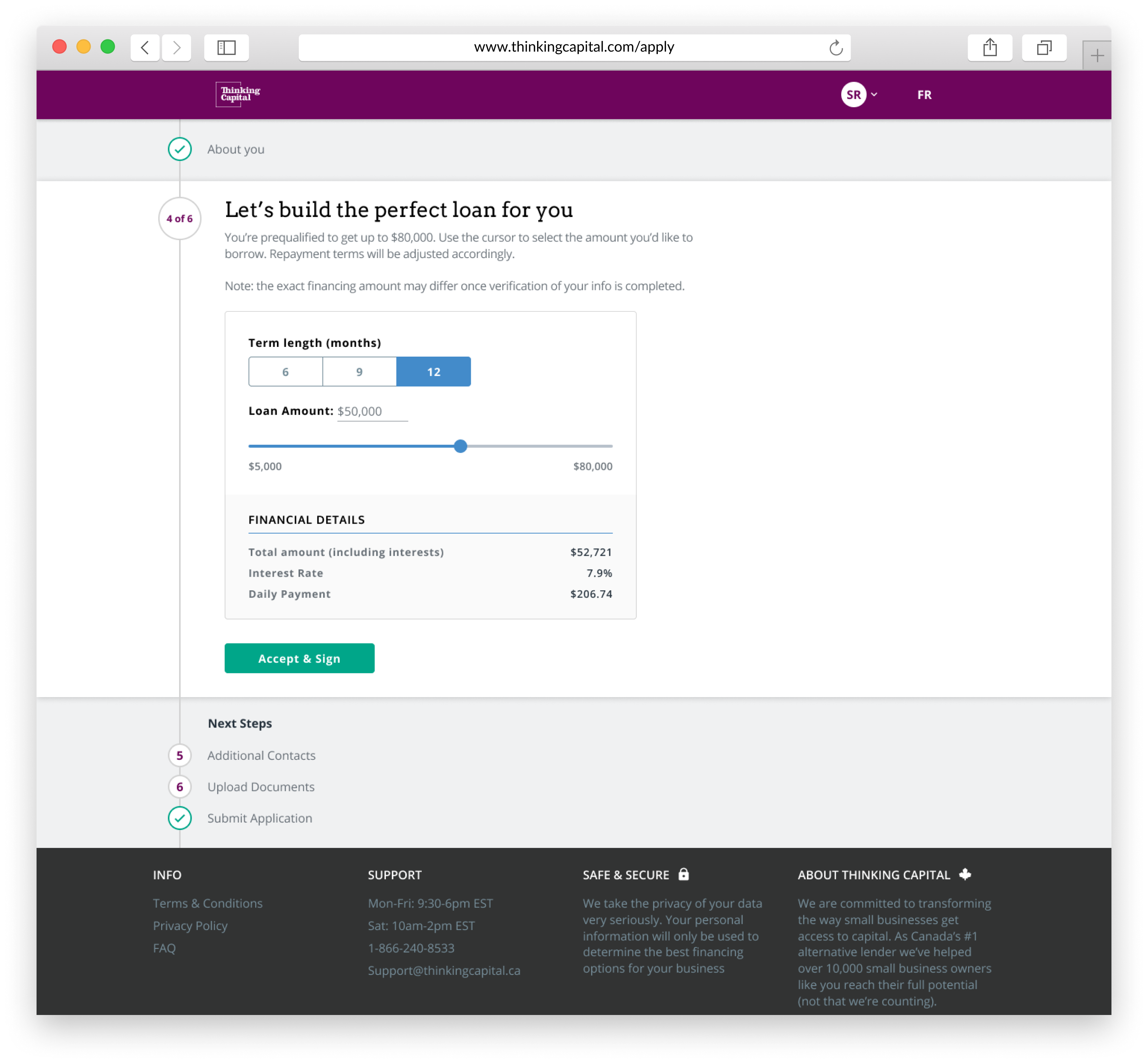
We created a tool to give customer the ability to customize how they would like to borrow. This calculator used smart defaults to present customer with what they asked for earlier in the application. We also made sure it would only present customer terms and dollars they were approved, this cut down errors from selections they weren't possible.
The biggest change for the new application was making it mobile responsive. This application wasn't built mobile first but we ensured that the experience was compromised for customers visiting from their phone.
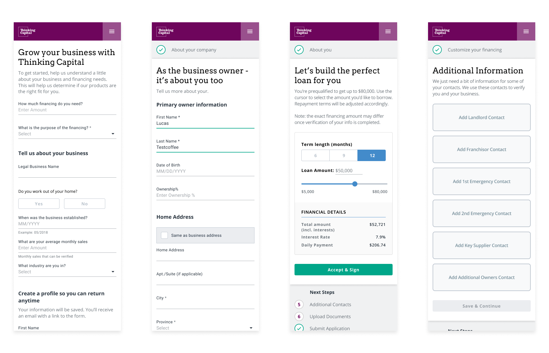
From left to right:
Qualification, Owner Information, Offer Customization, Additional Information.